Insurance Quote Portal & Operations Platform
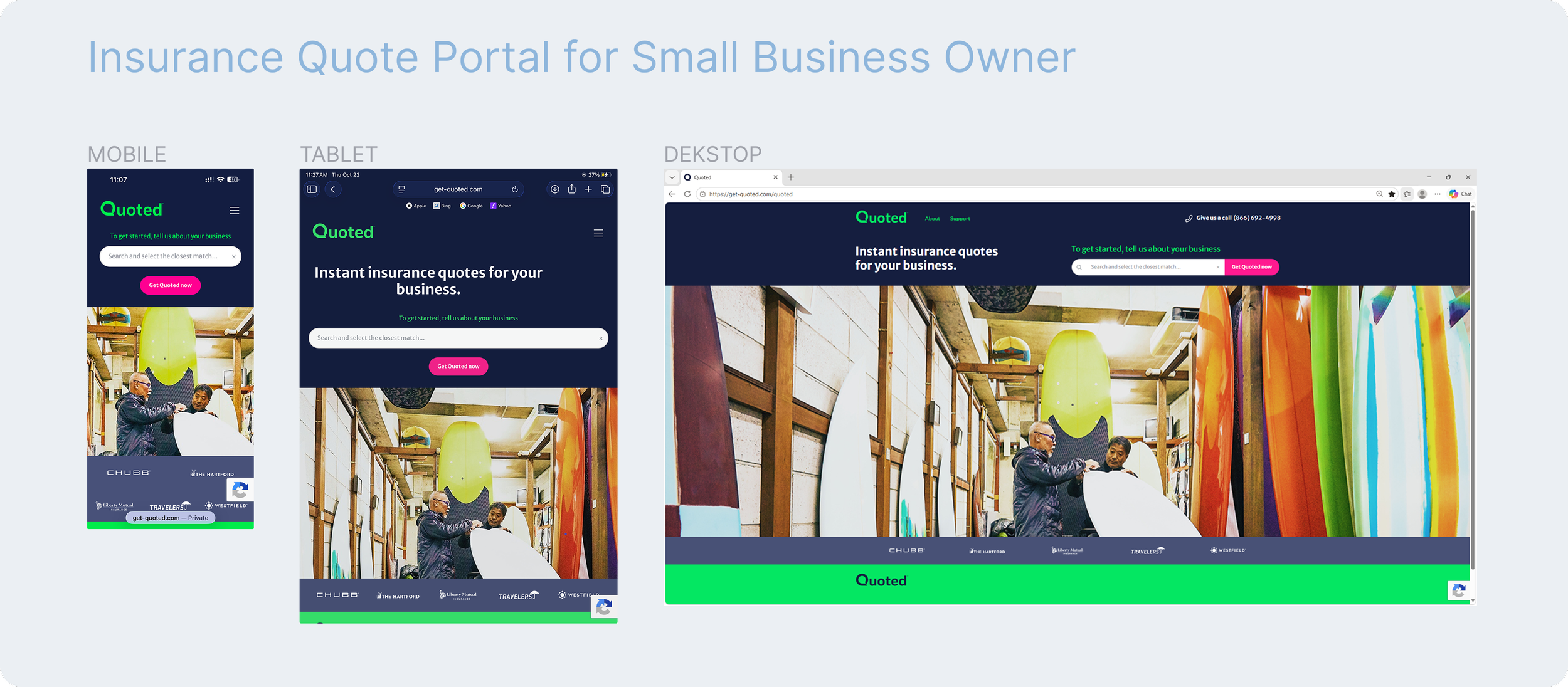
Simplifying complex insurance journeys for small business owners and internal teams
Role: UX Design Strategist / Lead
Industry: Insurance
Platforms: Responsive Web (Desktop, Tablet, Mobile) and Internal Operations Platform
Focus: UX Strategy, User Flows, Responsive Design, Interaction Design, Enterprise Design Systems, Prototyping
Designing for Two Distinct Audiences
The project focused on creating a connected digital insurance experience for two audiences with different needs.
Small business owners needed a clear, approachable way to explore, compare, and select insurance coverage without navigating overwhelming forms or unfamiliar terminology.
Internal business teams needed efficient tools to monitor portal performance, manage marketing campaigns, generate compliance reports, and onboard insurance partners.
The design challenge was to simplify both experiences while supporting complex insurance requirements, enterprise standards, and future partner integrations.
-
The project focused on creating a connected digital insurance experience for two audiences with different needs.
Small business owners needed a clear, approachable way to explore, compare, and select insurance coverage without navigating overwhelming forms or unfamiliar terminology.
Internal business teams needed efficient tools to monitor portal performance, manage marketing campaigns, generate compliance reports, and onboard insurance partners.
The design challenge was to simplify both experiences while supporting complex insurance requirements, enterprise standards, and future partner integrations.
-
Insurance quoting involves extensive data collection, conditional eligibility rules, multiple carriers, and coverage calculations.
For small business owners, these requirements translated into lengthy, dynamic forms that could become difficult to navigate, particularly on smaller screens.
For internal teams, the challenge involved managing reporting, partner onboarding, and operational workflows within a scalable framework.
The design opportunity: Make complex processes feel clear and manageable without compromising the information or controls required by the business.
-
Began mapping end-to-end user flows for both platforms, identifying key interactions, decision points, conditional logic, and system dependencies.
Early sketches and collaborative reviews helped clarify how users would move through the experience and where technical or business requirements influenced the journey.
These flows established a shared understanding across stakeholders and provided the foundation for wireframing and interaction design.
Turning Complex Forms into Manageable Steps
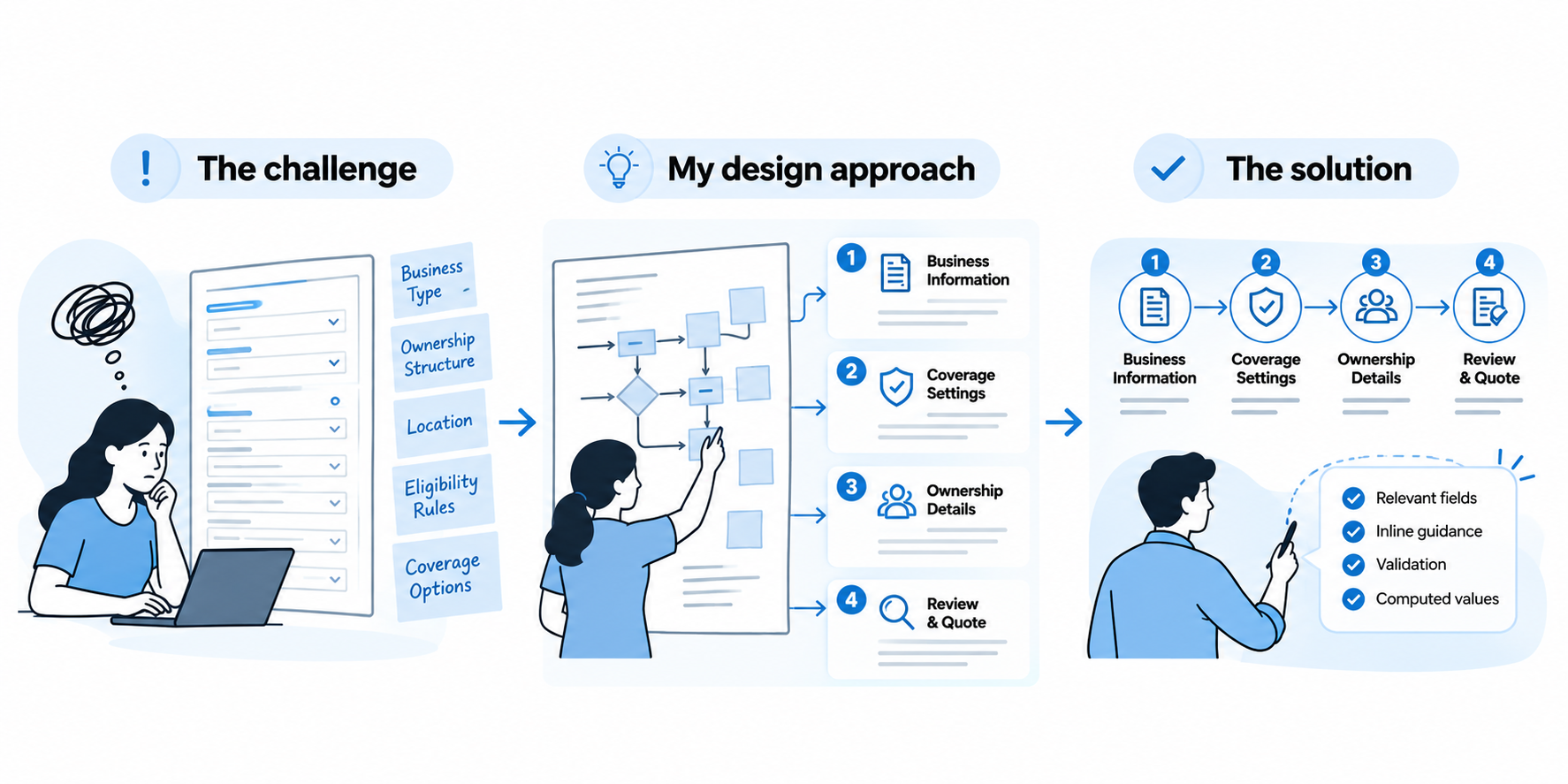
The challenge
The customer quote journey required extensive information that changed dynamically based on business type, ownership structure, location, and eligibility criteria.
Design iterations revealed that displaying too many fields simultaneously increased cognitive load, particularly on mobile devices.
My design approach
Reorganized the experience into logical sections, including business information, coverage settings, and ownership details.
Progressive form interactions helped users focus on relevant information, while validation patterns and inline guidance clarified requirements and computed values.
The solution
A structured, multistep quote experience that made complex data collection easier to navigate while retaining the information required for insurance quoting.
Turning Complex Forms into Manageable Steps
Responsive behavior was considered during wireframing rather than added after visual design.
Developed mid-fidelity layouts using consistent grid structures and interaction patterns across desktop, tablet, and mobile.
Desktop: Up to four fields per row to support efficient data entry.
Tablet: Two-column layouts to balance readability and available space.
Mobile: Single-column layouts with touch-friendly spacing and clearer task progression.
The objective was to preserve usability and interaction clarity across screen sizes without changing the underlying business logic.
Building Trust Through Visual Consistency
Explored competitive insurance experiences and visual references to establish a direction centered on trust, clarity, professionalism, and approachability.
High-fidelity designs were developed using the Enterprise Design System (EDS), applying established typography, colors, spacing, and reusable UI components.
For content-heavy screens, emphasized information hierarchy, readability, clear interaction states, and consistent patterns.
Adapted layout containers and components to accommodate data-heavy operational modules while working within enterprise design constraints.
-
Beyond the public quote portal, I designed workflows for an internal operations platform supporting business management and future growth.
The experience included:
Portal performance monitoring and reporting
Marketing campaign management
Compliance reporting workflows
Insurance partner onboarding
The design approach focused on clear navigation, structured data presentation, reusable interaction patterns, and flexibility to support additional partners.
-
The challenge
Some stakeholder expectations exceeded what the underlying technology could reliably support, introducing potential delays, failure scenarios, and implementation risks.
My approach
Worked closely with developers to explore feasible alternatives and created an interactive prototype demonstrating the revised experience.
During stakeholder walkthroughs, I used the prototype to communicate design trade-offs, fallback messaging, and progressive loading behavior.
The outcome
Stakeholders approved the revised feature scope, aligning the intended experience with technical feasibility while preserving clarity and user trust.
This reinforced the value of using prototypes not only to communicate interactions but also to facilitate decisions across product, business, and engineering teams.
-
Developed interactive Figma prototypes for the customer quote journey and internal operations workflows.
These prototypes supported stakeholder reviews, design iteration, technical discussions, and developer handoff.
The platform successfully launched, bringing together responsive customer experiences and internal operational capabilities.
Delivered contributions included:
End-to-end user flows and interaction logic
Responsive form and screen designs
High-fidelity interfaces aligned with the EDS
Interactive prototypes for critical workflows
Collaboration on technical constraints and implementation decisions
What This Project Demonstrated
Designing for two distinct audiences required balancing simplicity with complex business requirements.
The project strengthened my ability to translate conditional workflows into intuitive experiences, make informed design trade-offs, and align cross-functional teams through visual communication.
It also reinforced the importance of considering responsiveness, accessibility, system consistency, and implementation feasibility throughout the design process.
Future opportunities
With the platform launched, the next areas I would explore include contextual guidance for insurance terminology, usability testing with small business owners, and ongoing refinement informed by product usage data.
Key takeaway: Successful enterprise product design requires more than simplifying interfaces. It requires connecting user needs, business objectives, system constraints, and practical delivery into one coherent experience.