Case Study
Simplify complex, multi-step workflows for both audiences, customers on one side, and business users on the other, while maintaining clarity, regulatory compliance, and flexibility for future use.
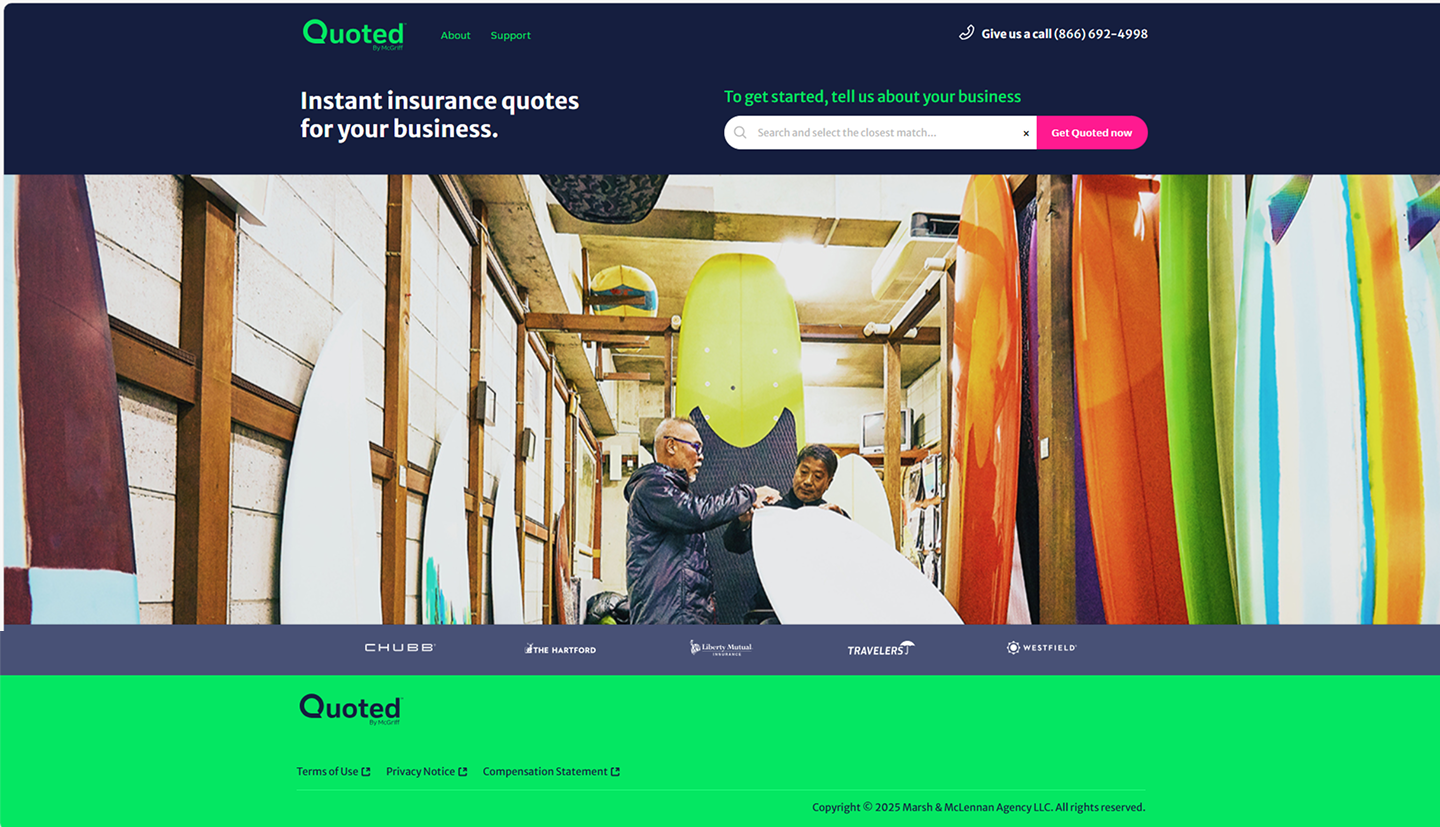
Insurance Quote Portal for Small Business Owner
Delivering a streamlined, end-to-end digital experience for two key audiences within the insurance ecosystem: small business customers and internal business teams. Solution was built as a dual-platform system consisting of:
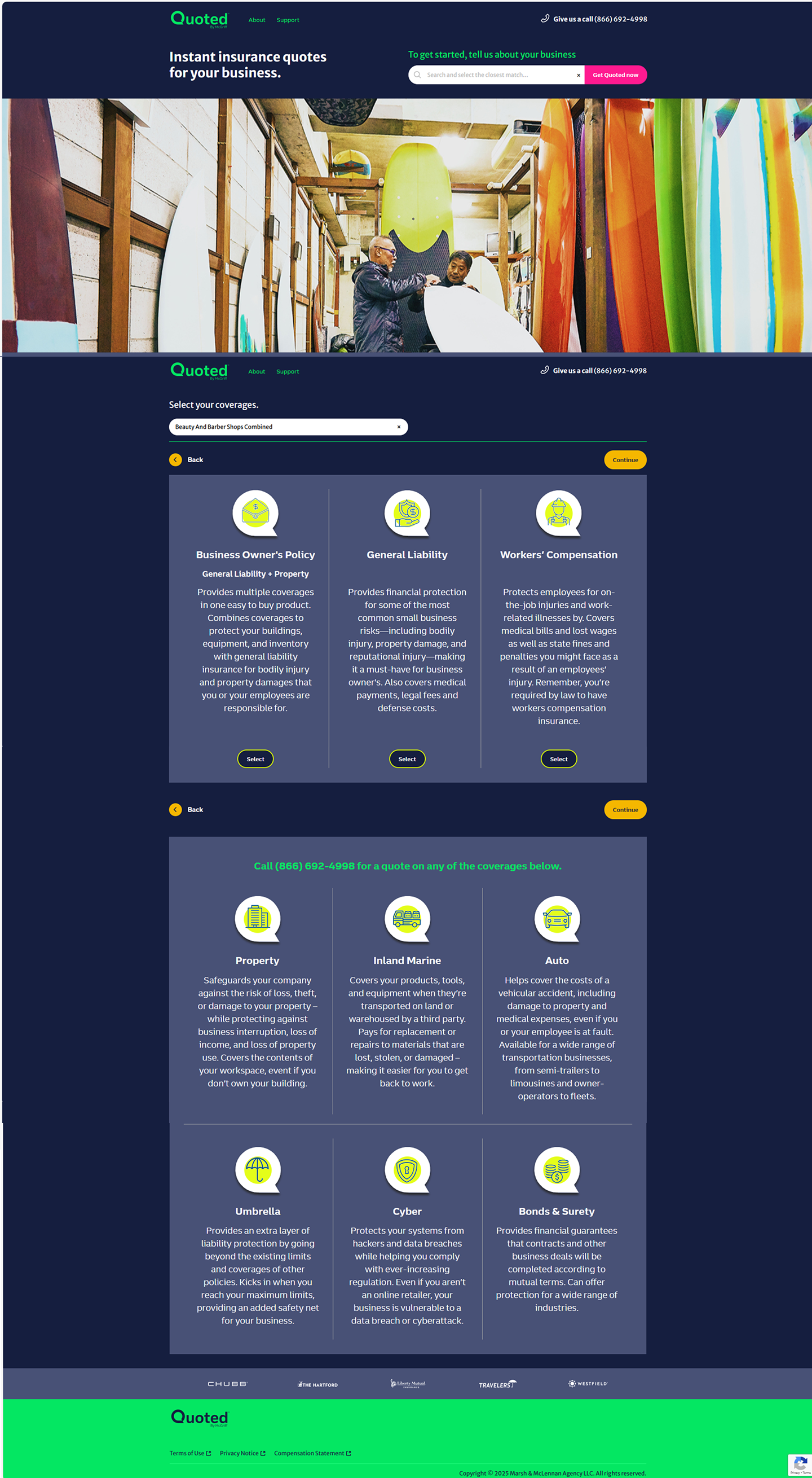
A public-facing quote portal that allowed small business owners to easily explore, compare, and select suitable insurance plans.
An internal operations and management platform designed to help business teams track portal performance, manage marketing campaigns, generate compliance reports, and efficiently onboard new insurance partners through a modular, partner-agnostic framework.
With both external and internal needs identified, the next step was
defining the goals that would guide every design decision forward.

Goal
Role
The goal of this project was to create a seamless digital experience for small business owners exploring insurance plans, while enabling internal teams to manage partner onboarding, marketing, and compliance through an efficient, adaptable backend interface.
To reach these objectives, I stepped into a strategic design leadership role that spanned both platforms.
Following the initial low-fidelity sketches, I translated key user flows into mid-fidelity wireframes using Figma. At this stage, the focus was on defining layout structure, content hierarchy, and interaction zones—without getting distracted by final styling or branding.
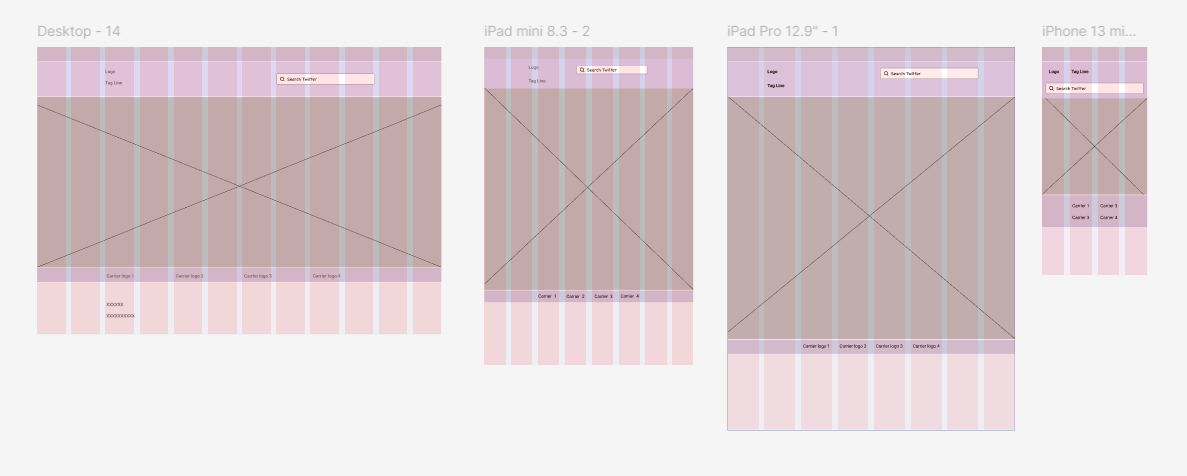
To ensure a consistent and accessible experience across devices, I extended the mid-fidelity wireframe system to cover column grid view to help organize content for desktop, tablet, and mobile states. This was especially important for workflows involving multi-step forms, data-heavy screens, and action-driven interactions.
Establish design consistency across viewports
Ensure key interactions—like quote submission, carrier quote comparison, report generation—remain intuitive across screen sizes
With the layout and structure established, I evolved the designs into polished visual experiences aligned with brand standards.
As the UX Design Strategist, I led the end-to-end experience design across both the customer-facing quote portal and the internal business operations platform. My role focused on simplifying complex workflows, aligning stakeholder needs, and delivering scalable, user-centric solutions through iterative design, system thinking, and strategic collaboration.
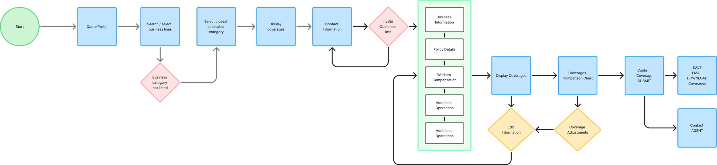
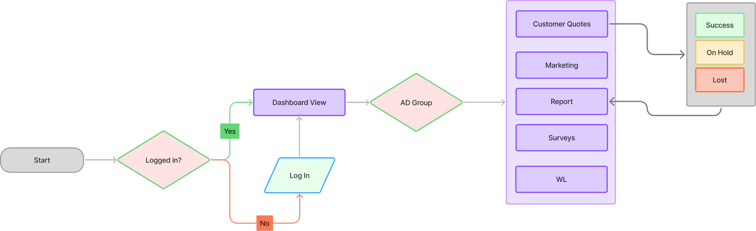
Before designing interfaces, I had to chart out how users would navigate the system—mapping every interaction and logic branch.
User Flow
My approach to lay the foundation for clear and intuitive user experiences began with creating detailed user flows for both the customer-facing quote portal and the internal operations platform. These flows bridged step-by-step actions, decision points, and backend interactions across both systems, helping align cross-functional teams around system logic and user intent from the start.
Sketched early concepts
Identified dependencies
Refined flow branches with collaborators
These user flows became the backbone of our wireframing and interface development.
Mid-Fidelity Wireframes
High-Fidelity UI Design
Transition from mid-fidelity wireframes to UI design - Once key flows were validated through mid-fidelity wireframes, I transitioned into high-fidelity UI design with a focus on visual consistency, accessibility, and alignment with the Enterprise Design System (EDS).
Adherence to brand colors, typography, and spacing rules defined in the EDS
Pre-approved UI components (e.g., buttons, form fields, tab groups) to ensure compliance and developer alignment
Prioritized readability, hierarchy, and task clarity in content-heavy modules (e.g. reporting grids, quote comparison)

To inform this visual direction, I explored emotional and competitive design cues.
Mood Board & Competitive Landscape Insights
To ground the product’s design direction in both emotional resonance and market expectations, I developed a visual mood board paired with a competitive feature audit of top insurance platforms and enterprise operations tools.
Establish a tone of trust, approachability, and clarity—especially for first-time insurance users
Explore visual metaphors related to security, professionalism, and small business empowerment
Align imagery and component patterns with enterprise complaint design system
Enterprise Design System (EDS) - foundational style guide
To ensure consistency, scalability, and accessibility across both the customer-facing quote portal and the internal business platform, all UI designs were built using our Enterprise Design System (EDS) as the foundational style guide.
• Extended style containers for data-heavy modules
• Maintained intuitive flows within enterprise constraints
With system components ready, I turned designs into interactive experiences to simulate real-world usage.
Interactive Prototypes
Bringing the experience to life and validate the design logic early, Developing interactive prototypes in Figma for both the customer-facing quote portal and internal business platform. These clickable flows helped stakeholders, developers, and testers experience the interface in context—well before development.
Simulated quote tasks, comparisons, and reporting
Facilitated feedback and improved developer handoff
Prototyping uncovered design challenges that required thoughtful UX problem-solving.
Challenges & UX Solutions
As the project progressed, we navigated design complexities—from quote logic to reporting UX.
Addressed backend errors and validation patterns
Reduced drop-offs with clearer flows and micro-interactions
Each challenge tackled contributed directly to overall impact across platforms.
Challenge 1 - Stakeholder Expectations vs. Technical Feasibility
Technical constrains/limitation - where expectations don’t align with the technical realities
unpredictable delays or failure points - communicating Stakeholders on these constraints
pressure on the team
Solution- Collaborate to bridge this gap
collaborated closely with developers to prototype a realistic version of the proposed task flow
Designed an interactive prototype to simulate the end-user experience
Facilitated a walkthrough session with stakeholders using the prototype to explain what’s feasible, what’s risky, & where trade-offs were needed with team.
Outcome
The visual and functional clarity of the prototype helped align stakeholders with technical constraints. They not only signed off on the revised feature scope but appreciated how the design preserved user trust through thoughtful fallback messaging and progressive loading cues. This exercise showed how UX isn’t just interface design—it’s strategic communication that helps teams converge around what's both desirable and achievable.
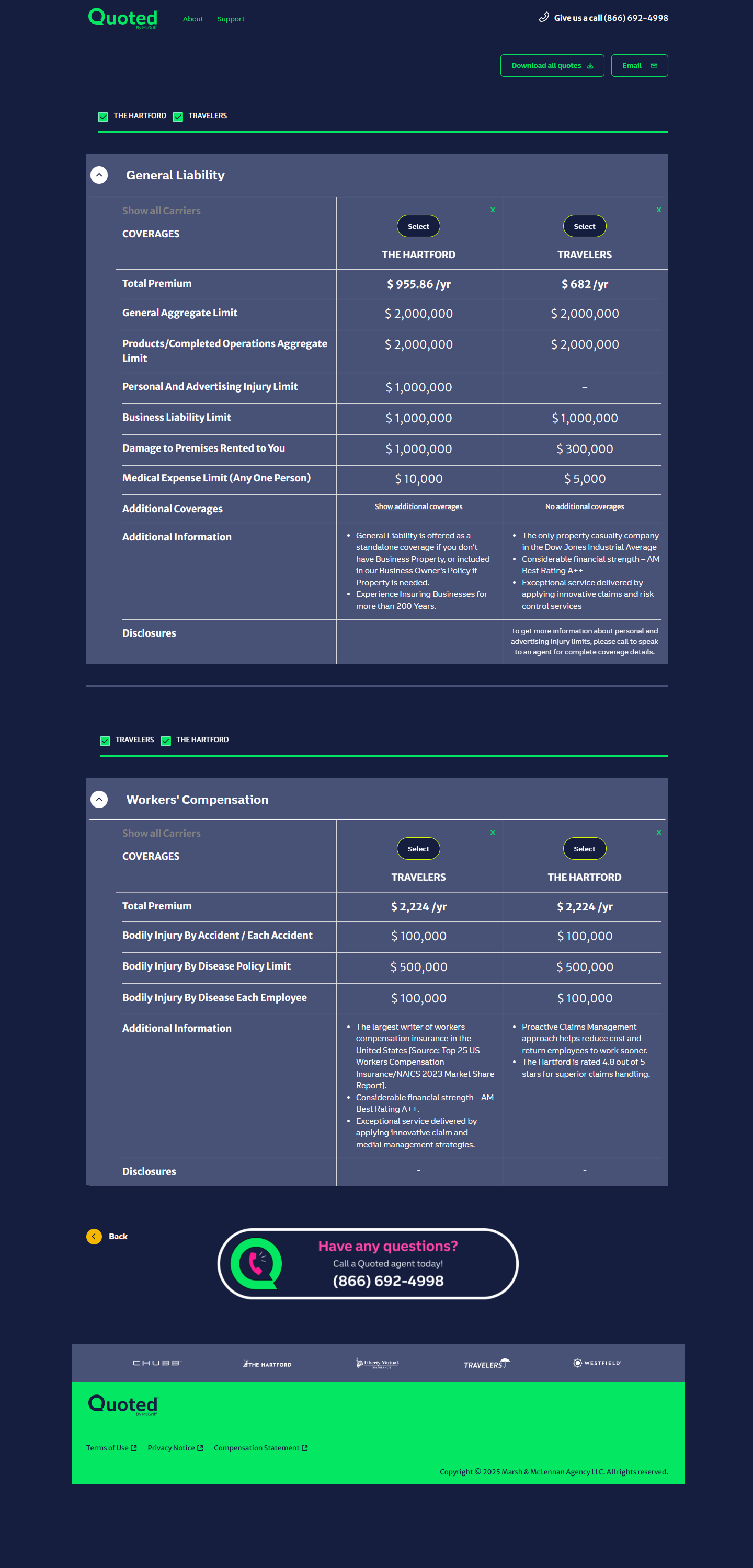
Challenge 2 - Designing Complex Multistep Insurance Quote Forms Across Devices
Small business users interacting with the Insurance Quote Portal were required to fill out extensive, variable forms. These forms adjusted dynamically based on business type, ownership structure, location, and other eligibility criteria—feeding into automated coverage calculations from multiple carriers.
Form was data-heavy and changed field sets based on business type and ownership %
Field density and layout adaptation across devices
Iteration rounds revealed cognitive overload from seeing too many fields at once, especially on smaller devices.
Solution - Led iterative design sessions to address layout complexity and task clarity
Created grouped section views that broke forms into digestible, themed clusters - business info, coverage settings, ownership breakdown
Used progressive form logic to validate and expand sections as completed - minimizing user overwhelm
Defined responsive breakpoints where:
Desktop showed up to 4 fields per row
Tablet collapsed to 2 per row
Mobile streamlined to 1 field with touch-friendly spacing
Included inline guidance for computed values, helping users understand input-output relationships
Outcome
The final experience delivered an intuitive, responsive multistep form that respected user cognitive limits while satisfying carrier data requirements.
And also letting Users feel confident navigating dense insurance details with ease, thanks to scoped views and microcopy guidance
This challenge highlighted how responsive design, validation logic, and content grouping can turn overwhelming workflows into intuitive experiences—especially for users who aren’t insurance-savvy.
Each challenge tackled contributed directly to overall impact across platforms.
Impact
Throughout this project, as a UX Design lead Strategist guiding both vision and execution, from whiteboard flows to final interactive prototypes. My contributions directly shaped the clarity, usability,
and scalability of the dual-platform experience.
Once the dust settled, I reflected deeply on what this experience taught me.
Reflection
This project challenged me to go beyond surface-level work and dive deep into system design, workflow orchestration, and the realities of enterprise governance.
• Balanced clarity with extensibility
• Advocated for users while meeting enterprise needs
• Collaborated with cross-functional teams to scale thoughtfully
Even though the platform launched successfully, there were still opportunities I saw for future refinement.
What I’d do next…
While the platform delivered on its core goals and received positive internal feedback, there are a few directions
I would explore further to enhance both user experience and business value.
Add contextual help for insurance jargon-heavy flows
Conduct usability tests with real end-users
Leverage usage data for iteration cycles
And that brings me to the final chapter of the journey…
Conclusion
This project was a unique opportunity to solve complex problems for two very different user groups—small business customers seeking clarity and speed, and internal business users needing structure and control. Through structured user flows, responsive mid-fidelity wireframes, Enterprise scalable component design system (EDS), and detailed prototyping in Figma, I helped transform abstract insurance workflows into a clear, efficient, and user-focused product experience. Adherence to the enterprise design system ensured long-term maintainability, while flexible thinking allowed the product to retain personality and empathy.
The result: a platform that supports business growth, regulatory confidence, and real-world usability across all touchpoints—whether a coffee shop owner is reviewing quotes on a phone or a spa owner from a tablet.